Need help in using our WordPress theme?
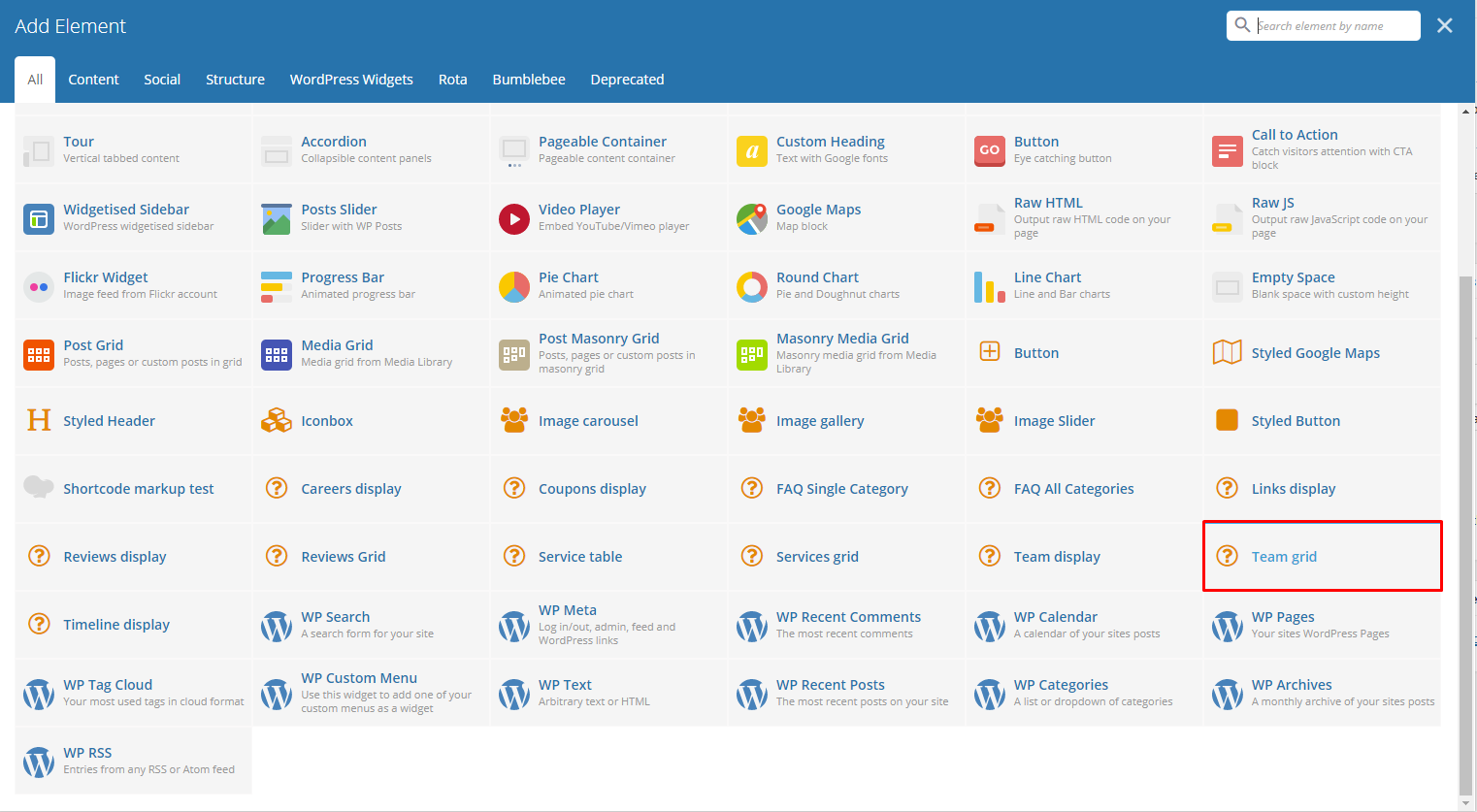
With Rota comes many custom shortcodes for (Visual Composer) VC that are used to show content created in Rota.
Below you will find short information about this Visual Composer elements:
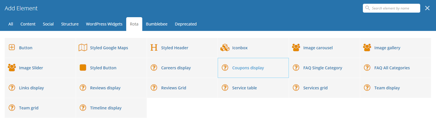
|
|
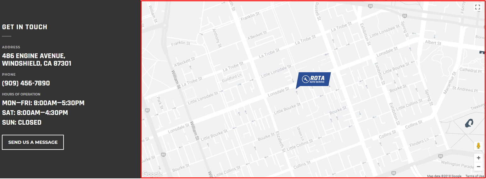
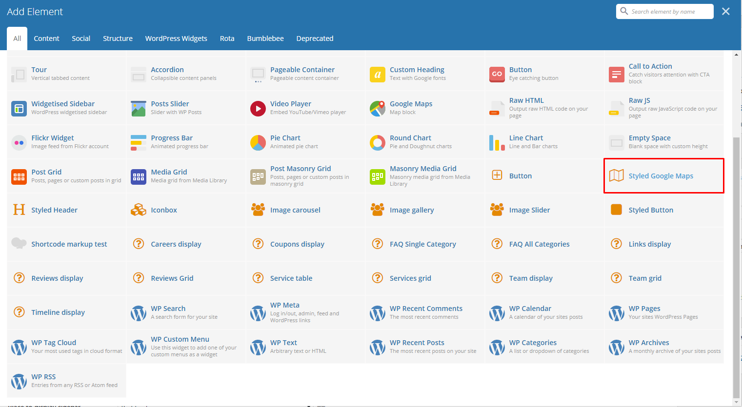
Lets you add a styled google map on a page. You will be able to customize this map in the Styled Google Maps Settings.
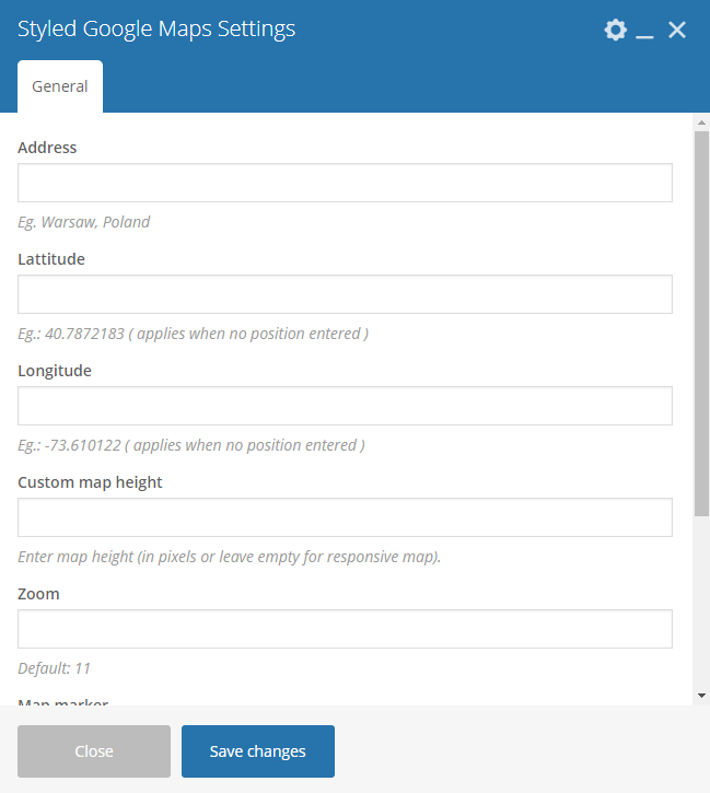
|
Sample:
|
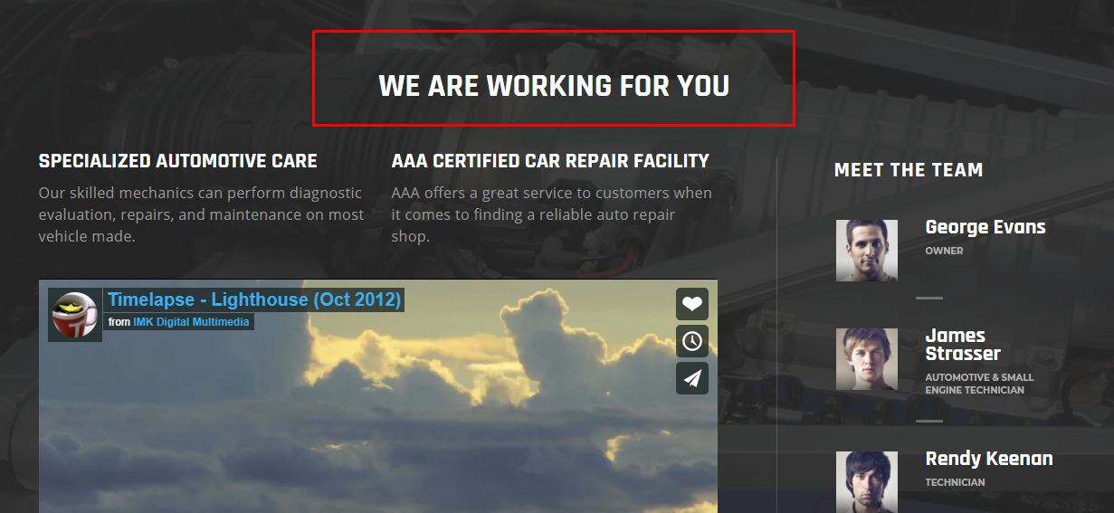
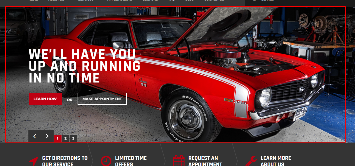
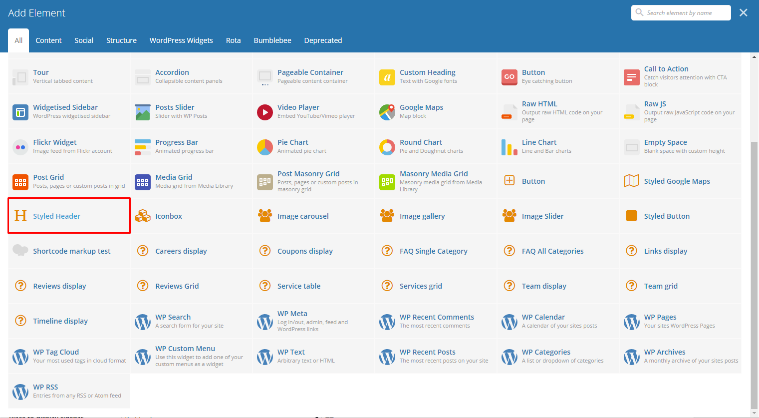
This theme comes with VC element that give you the option to create a header title that can be used in the theme.
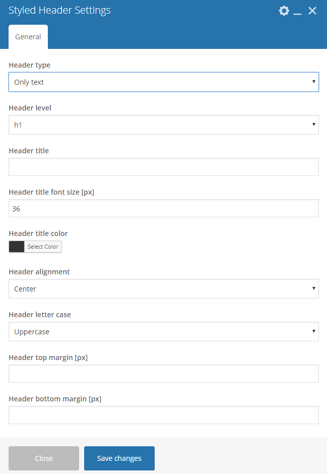
|
Header type - Format of how the title would look like: Only text or With text and decoration.
Header level
Header title - What is written as the title.
Header title font size[px] - Font size of the title.
Header title color - The color of the title’s font.
Header alignment - Alignment of the title in the page.
Header letter case - Letter case of the title.
- Lowercase - All letters in the title are in lowercase.
- Uppercase - All letters in the title are in uppercase.
- Capitalize - Only the first letter of the words in the title are uppercase.
- None - Default letter case is used.
Header top margin[px] - Top margin of the title.
Header bottom margin[px] - Bottom margin of the title.
Sample:
|
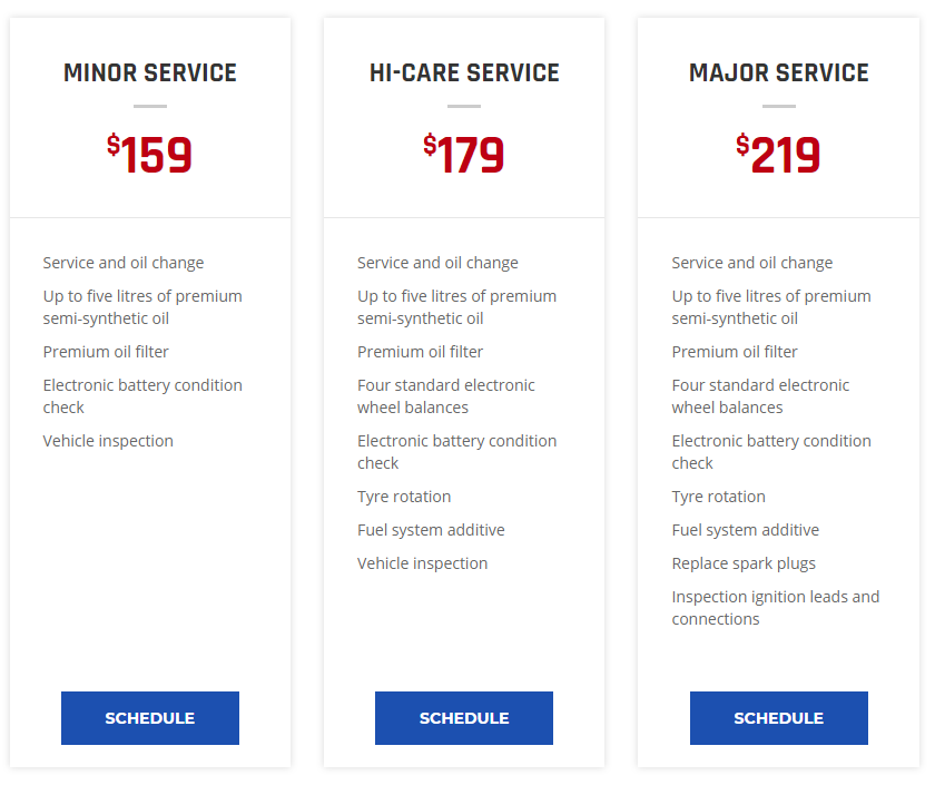
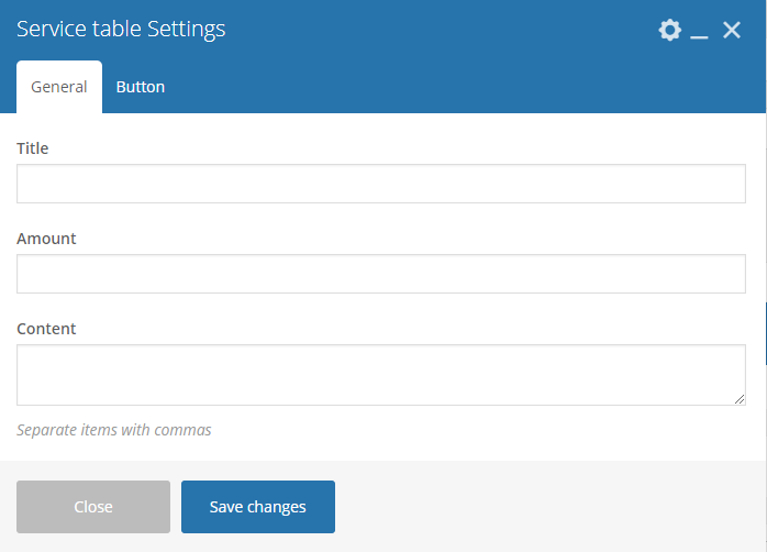
Below you will see all the available options that can/need to be set to use Pricing Table.
|
Sample:
|
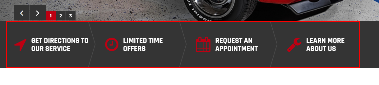
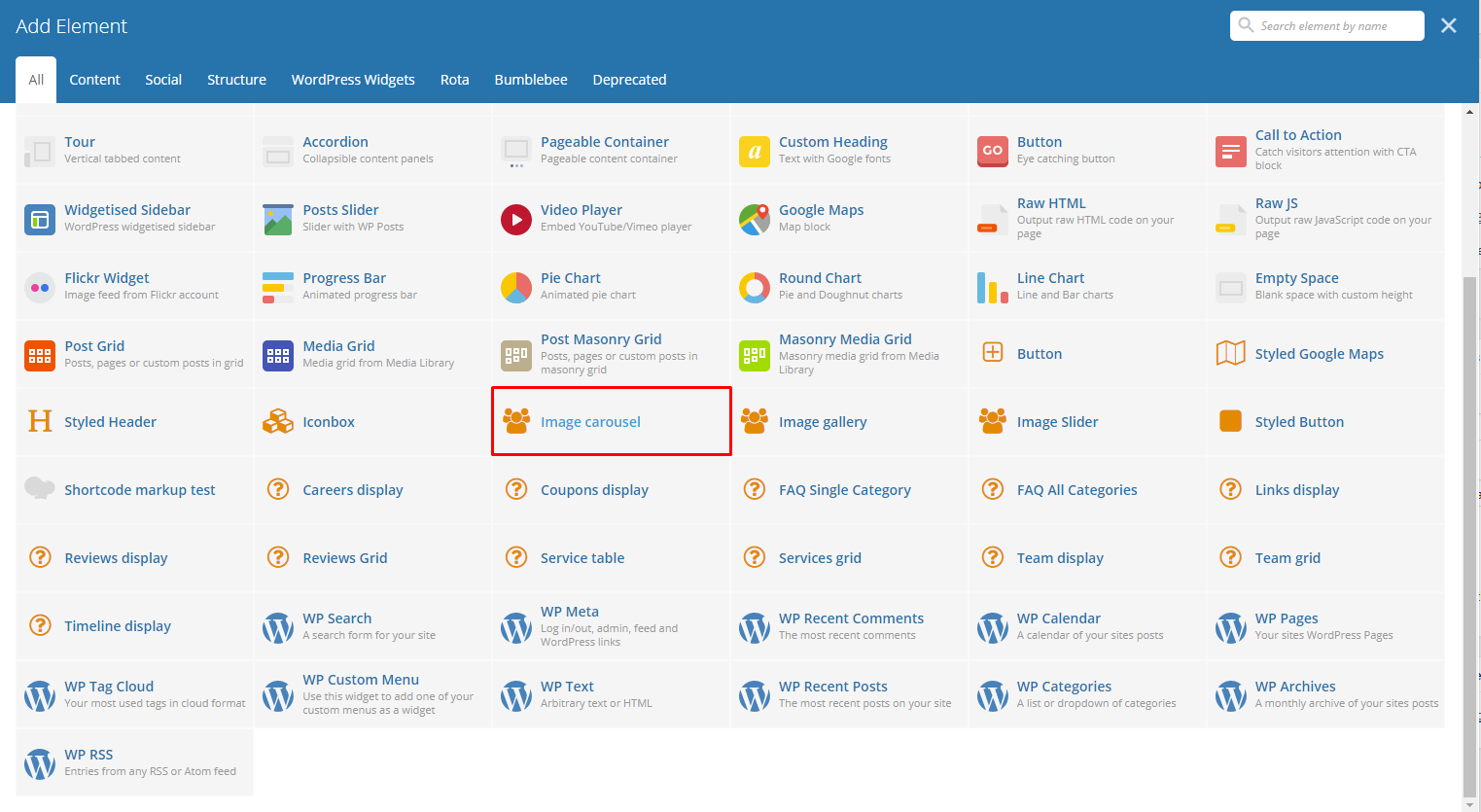
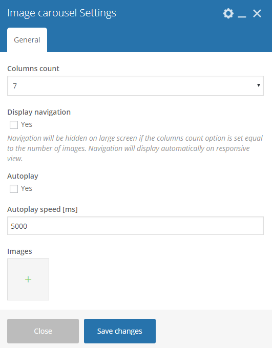
This will create an animated carousel with images on the page.
|
Sample:
|
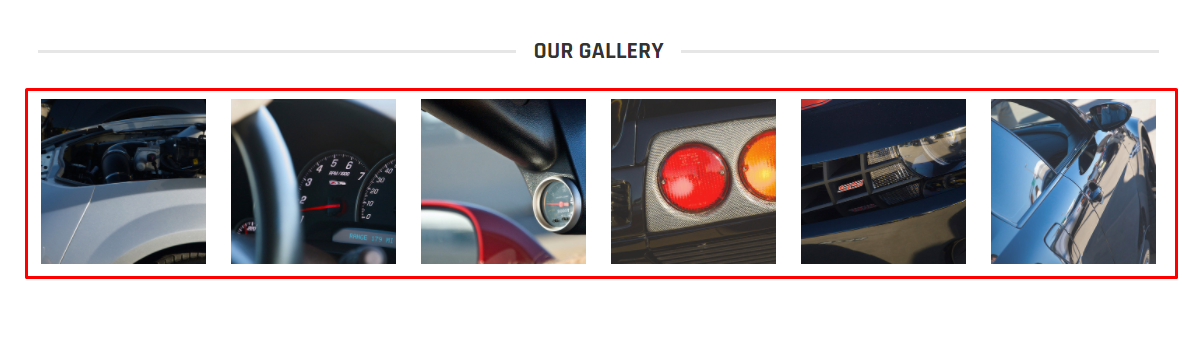
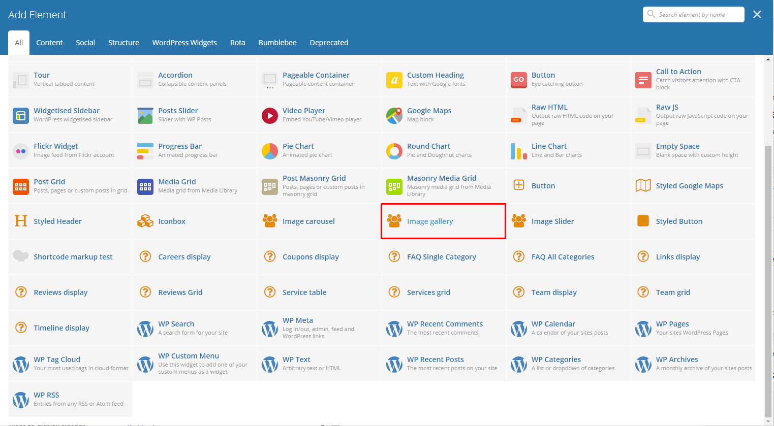
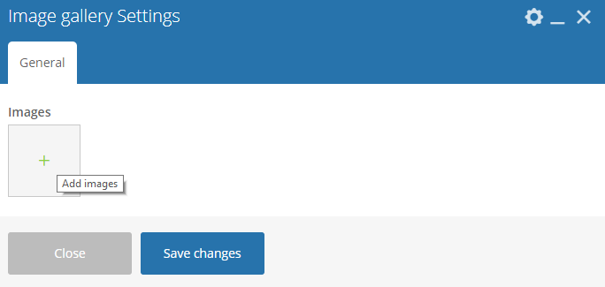
This will create a group of image in the page.
|
Sample:
|
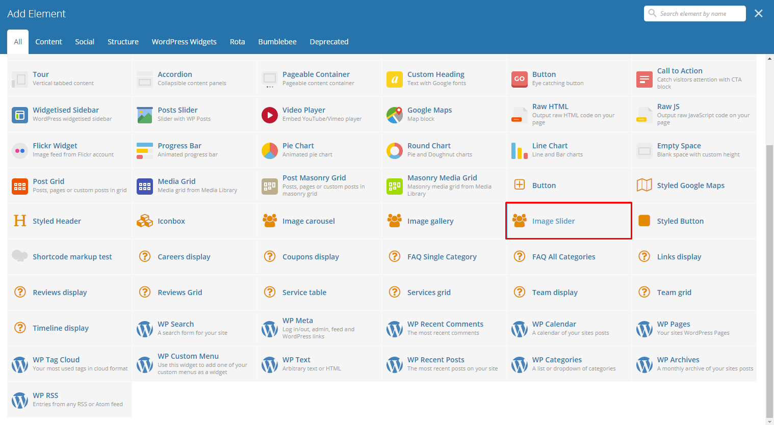
This will display an image slider in the page that is responsive.
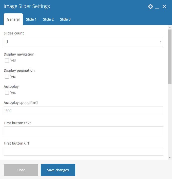
|
Sample:
|
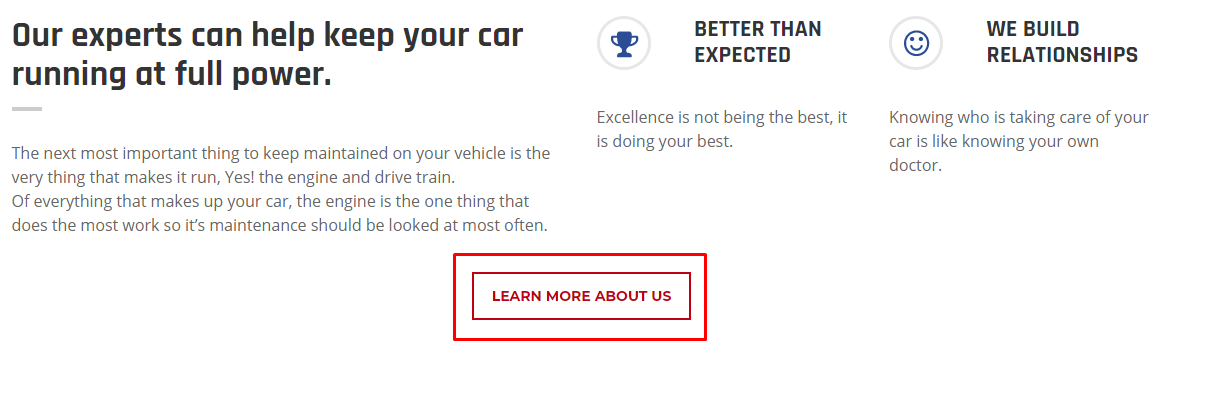
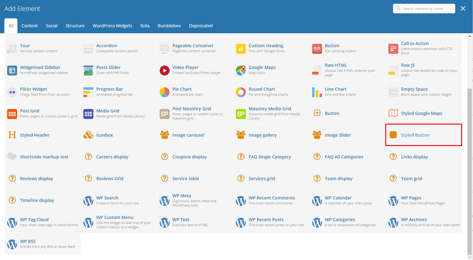
This element lets you add a button that is customized by you.
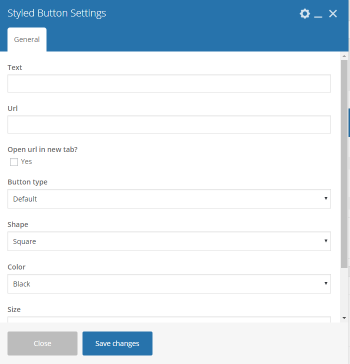
|
Sample:
|
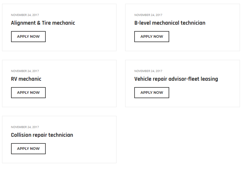
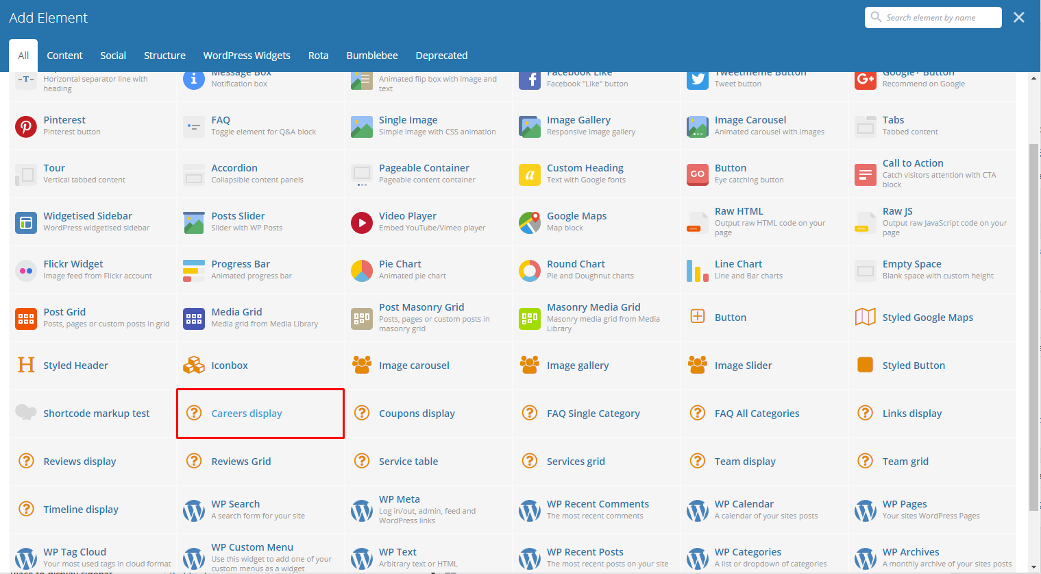
This will let you show items in Careers items.

|
Sample:
|
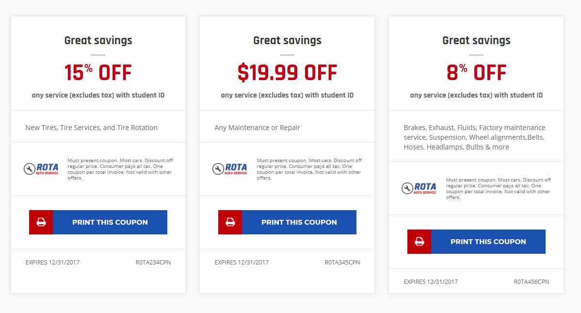
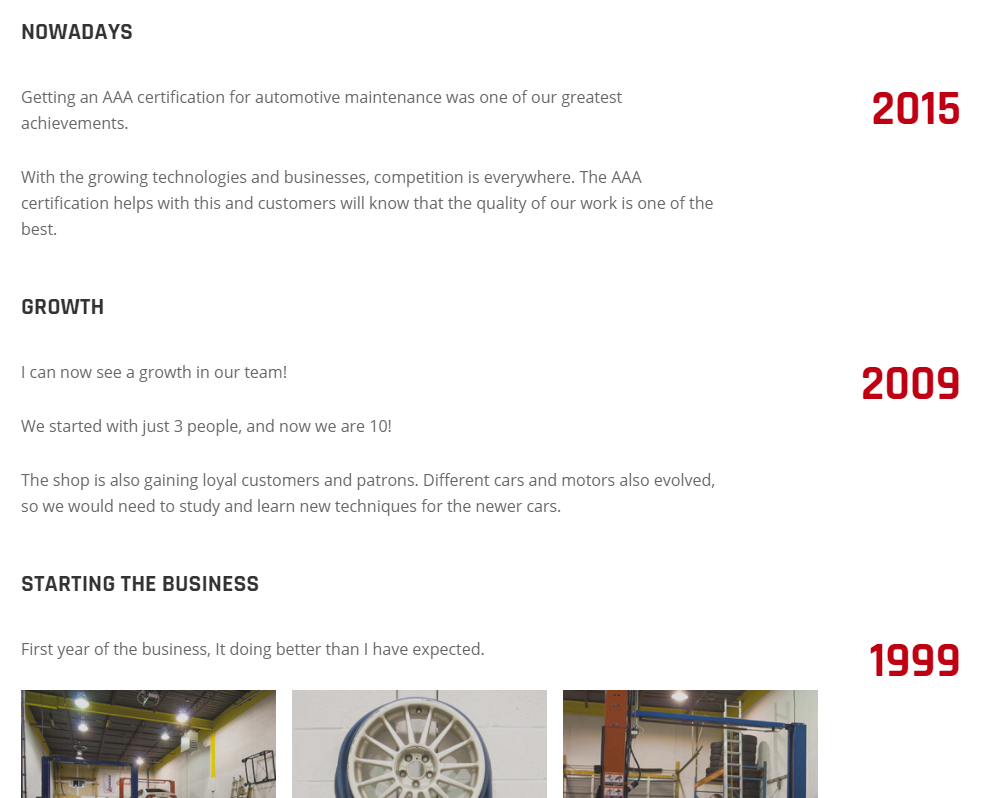
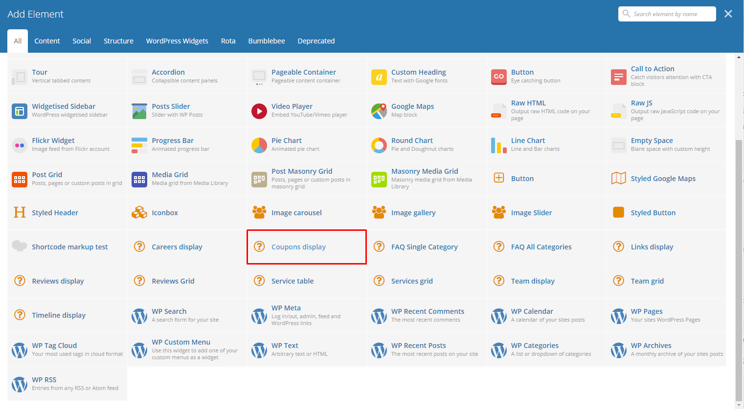
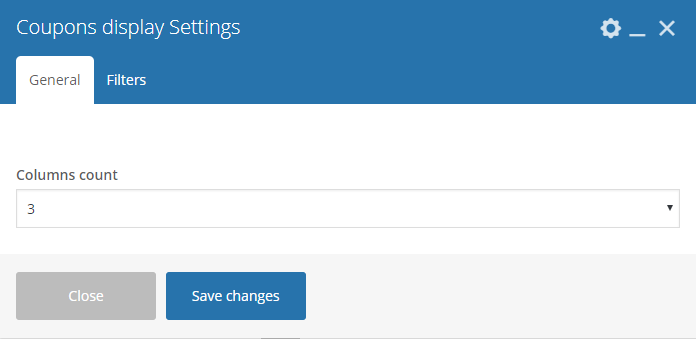
This element will show the items inside Coupons in the page.
|
Sample:
|
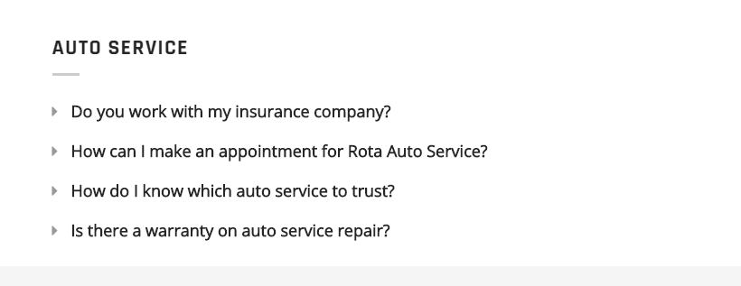
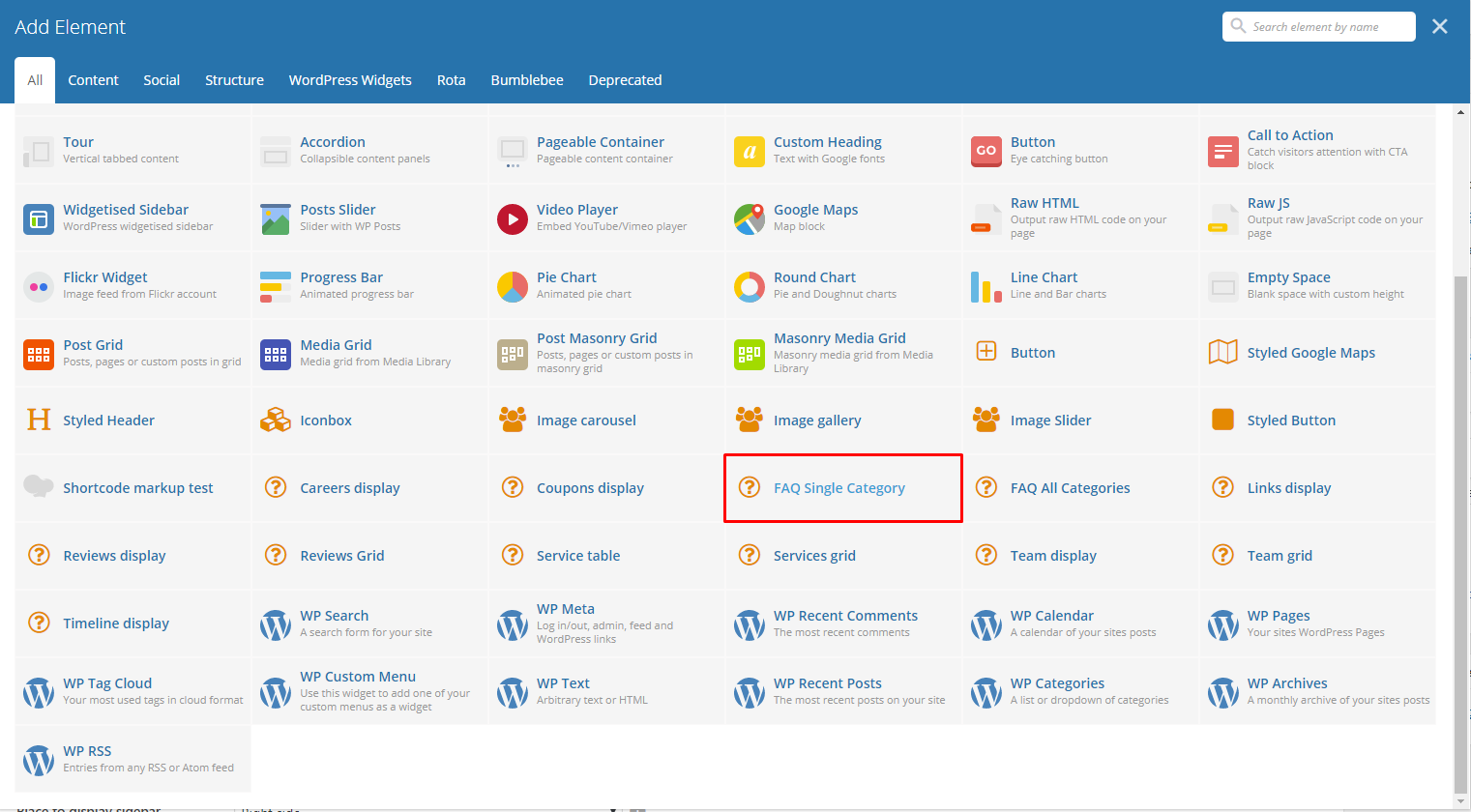
This element lets you add an FAQs with a single category on the page.
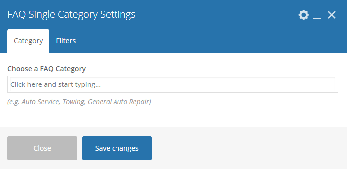
|
Sample:
|
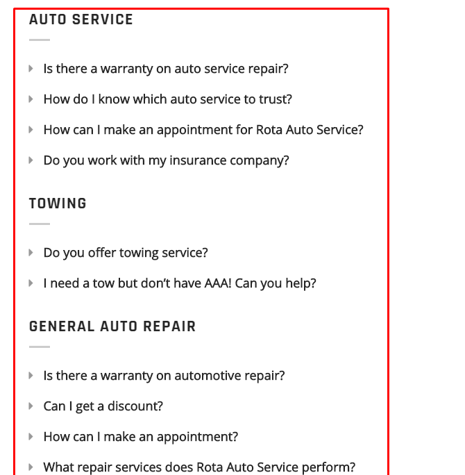
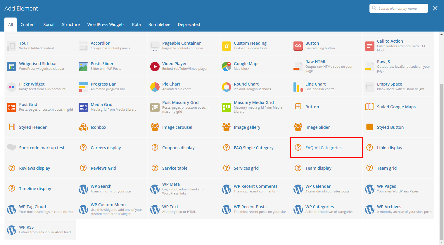
This element lets you add all the FAQs on the page.
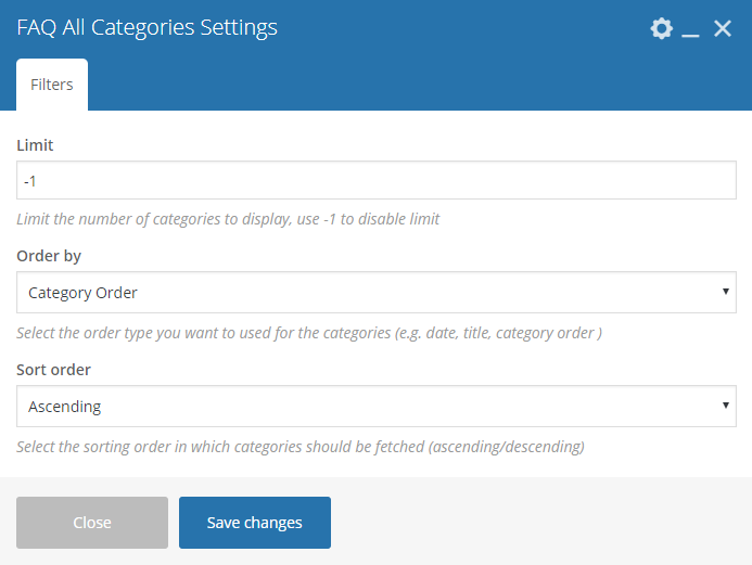
|
Sample:
|
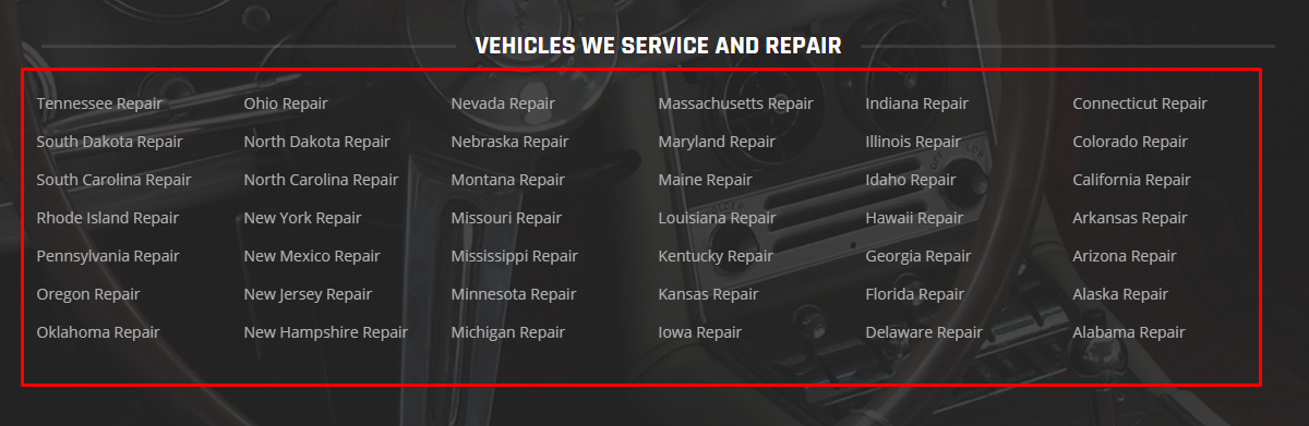
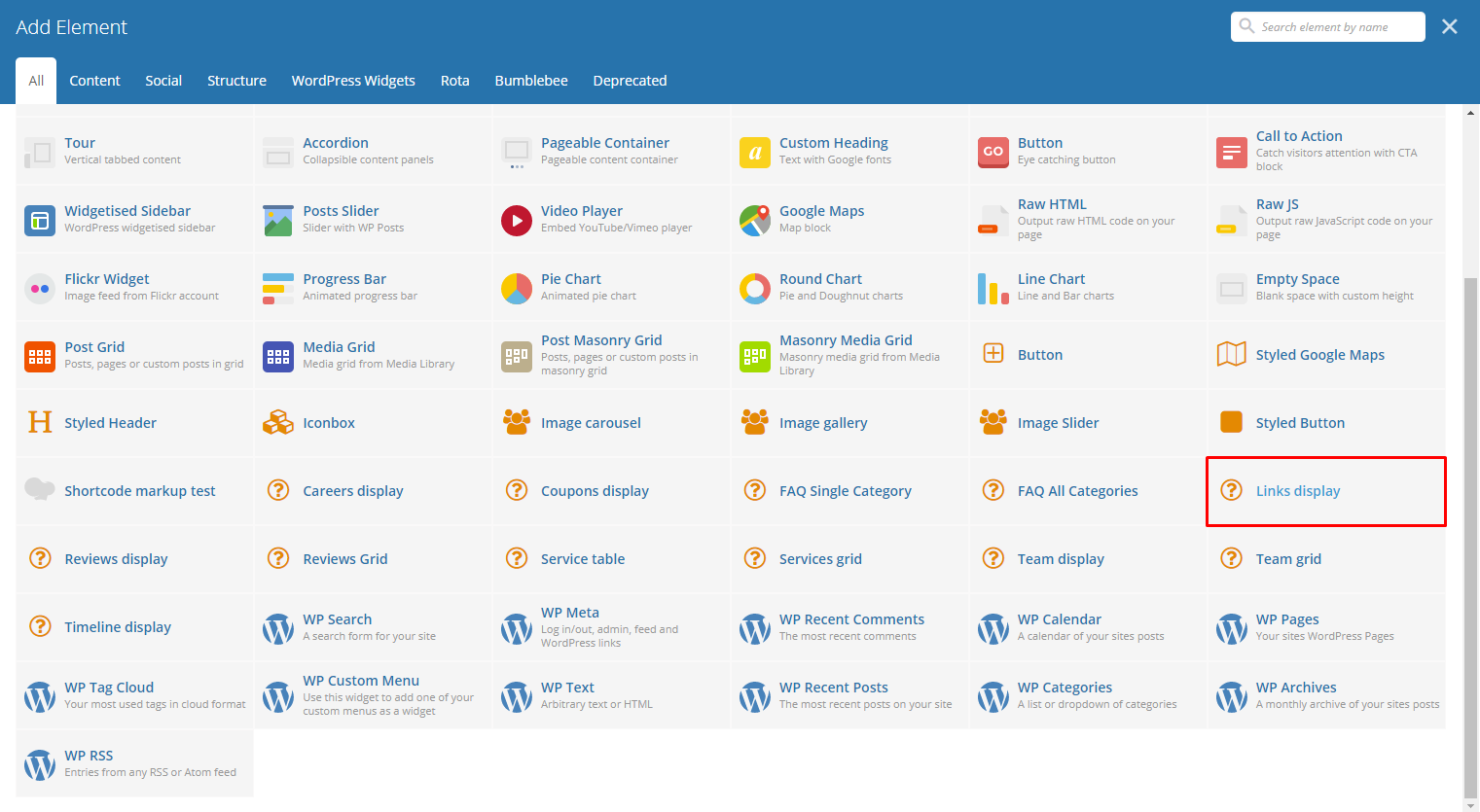
This element lets you display all the links inside Links.
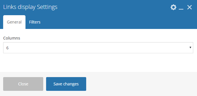
|
Sample:

|
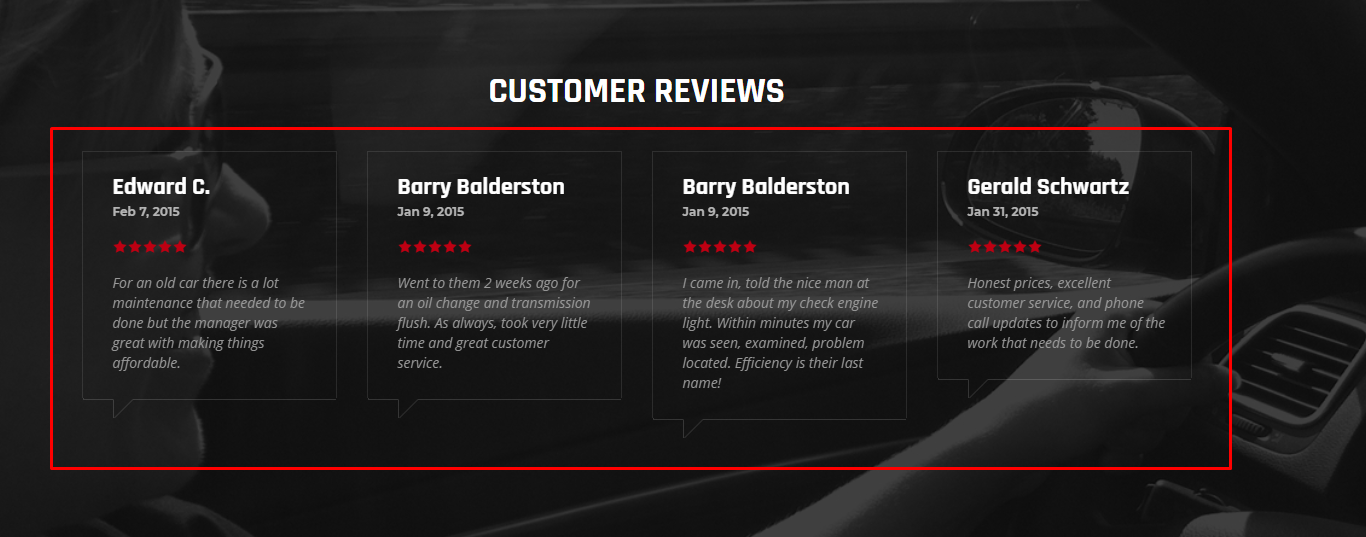
Lets you display the items in Reviews inside a slide.
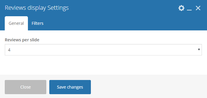
|
Sample:
|
Lets you display in a grid view the items in Reviews.
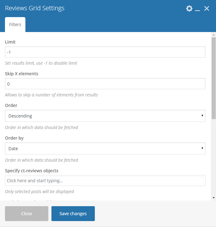
|
Sample:
|
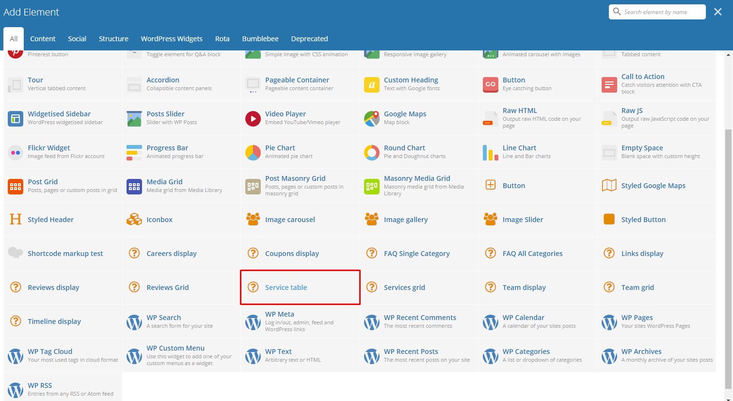
Lets you add a table that you can customize with the services you want to add.
|
Sample:
|
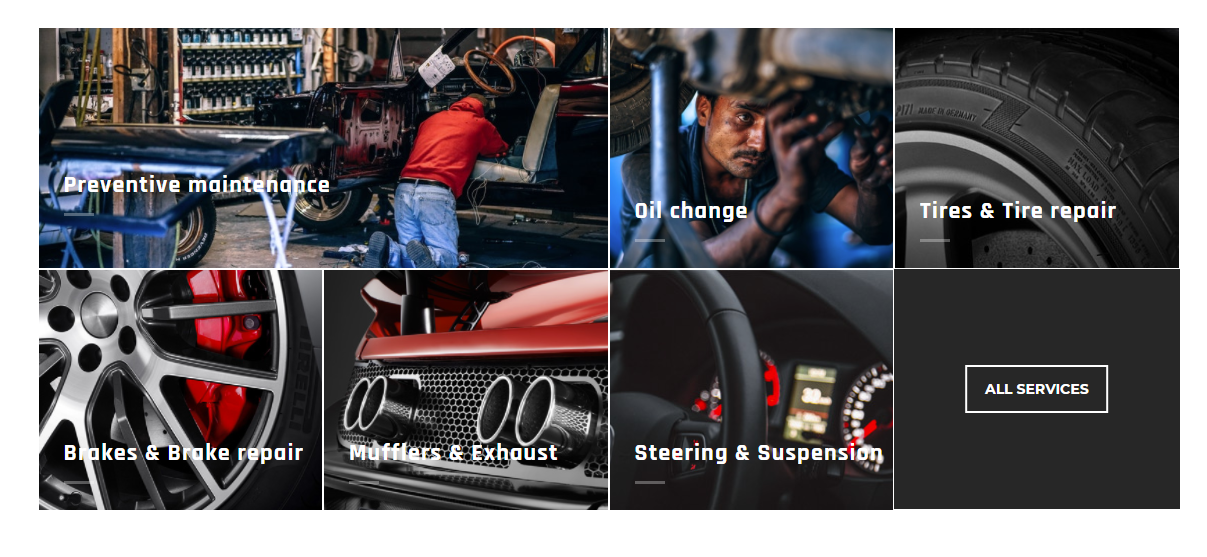
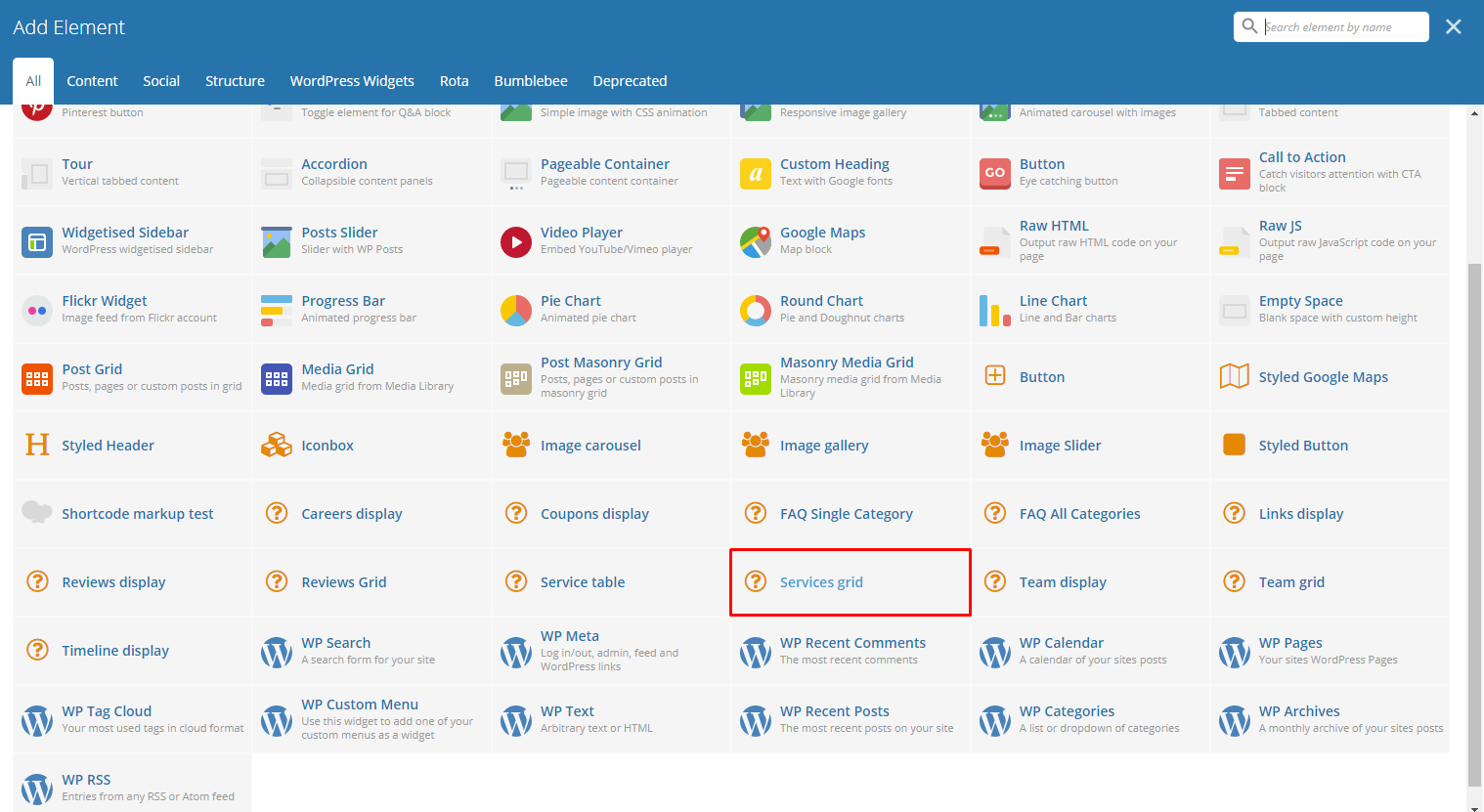
Lets you display in a grid view the items in Services.

|
Sample:
|
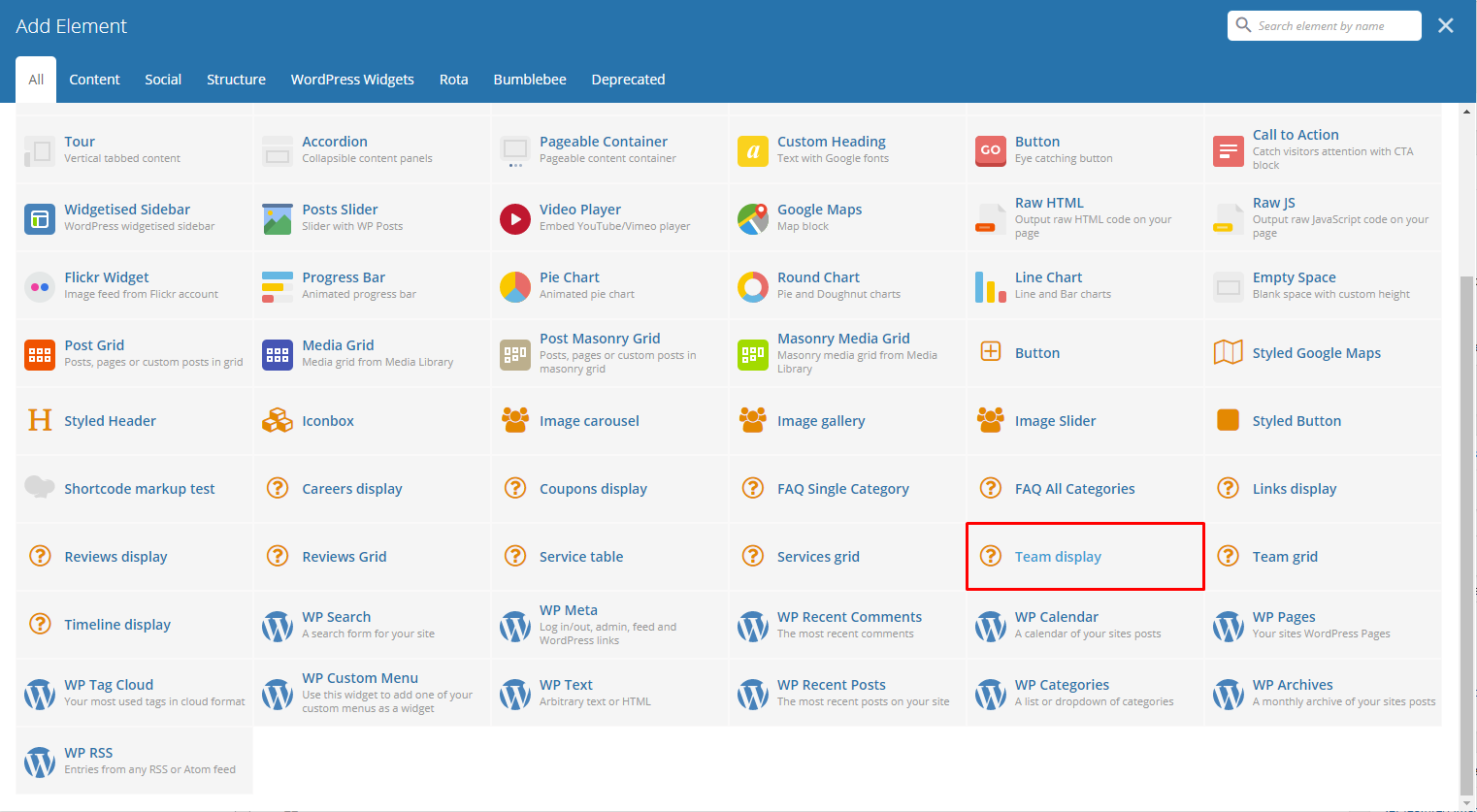
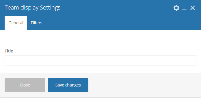
Lets you add a table of the team members created in the Team Members. To know how to create a team member item, go to Create Team Member tutorial.
|
Sample:
|
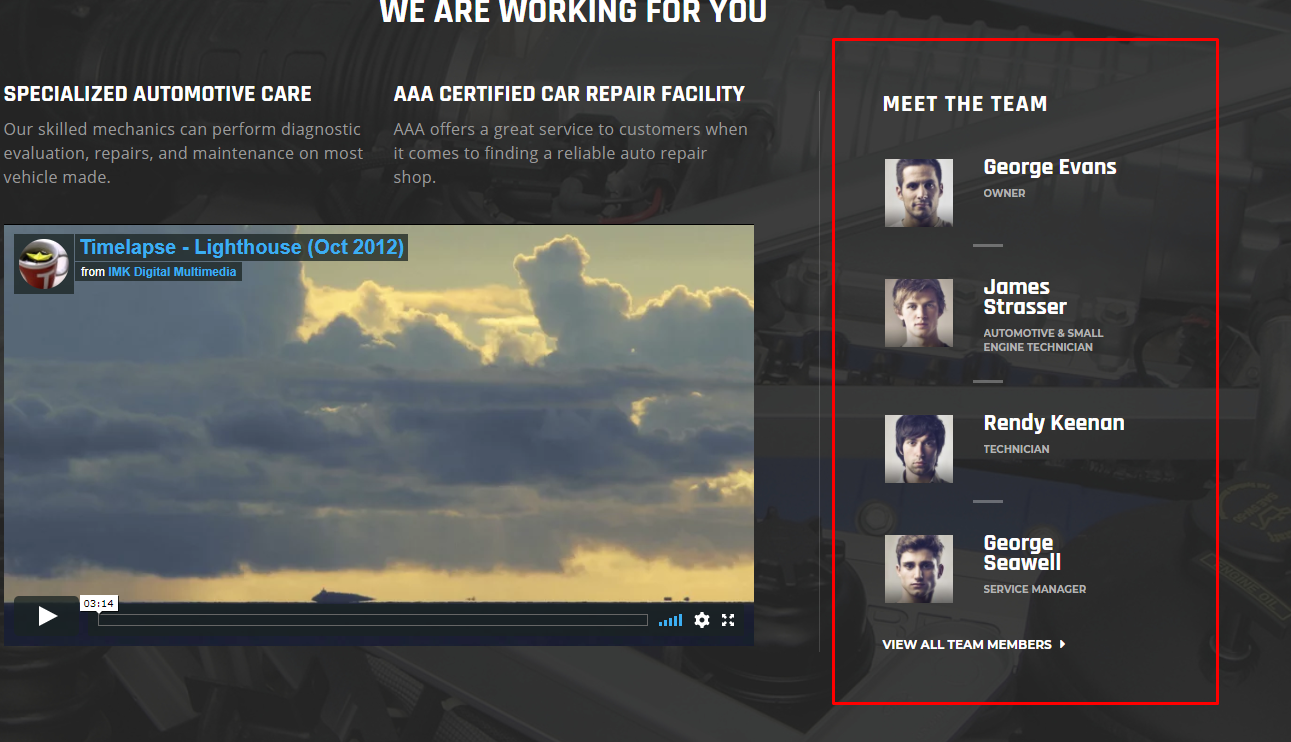
Lets you add a grid view of the team members created in the Team Members. To know how to create a team member item, go to Create Team Member tutorial.

|
Sample:

|
Gives you an option to show people dynamic Testimonial Items that are made on your site.
|
Sample: